Relay: Positioning a Creator-Brand Partnership OS
BRAND DESIGN
Relay is a full brand and product system built from zero. Identity and go-to-market collateral, all designed to solve one problem. Creator-brand partnerships run on chaos. Relay runs on structure.
Contract 2026
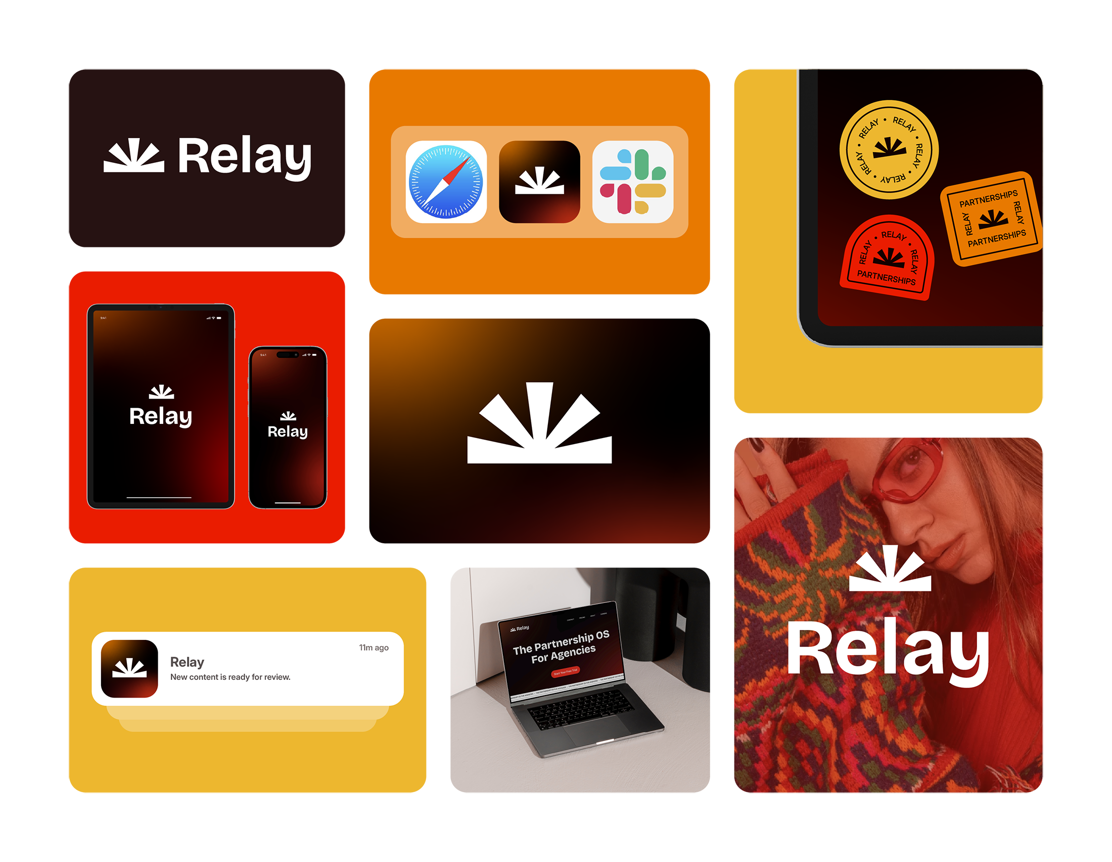
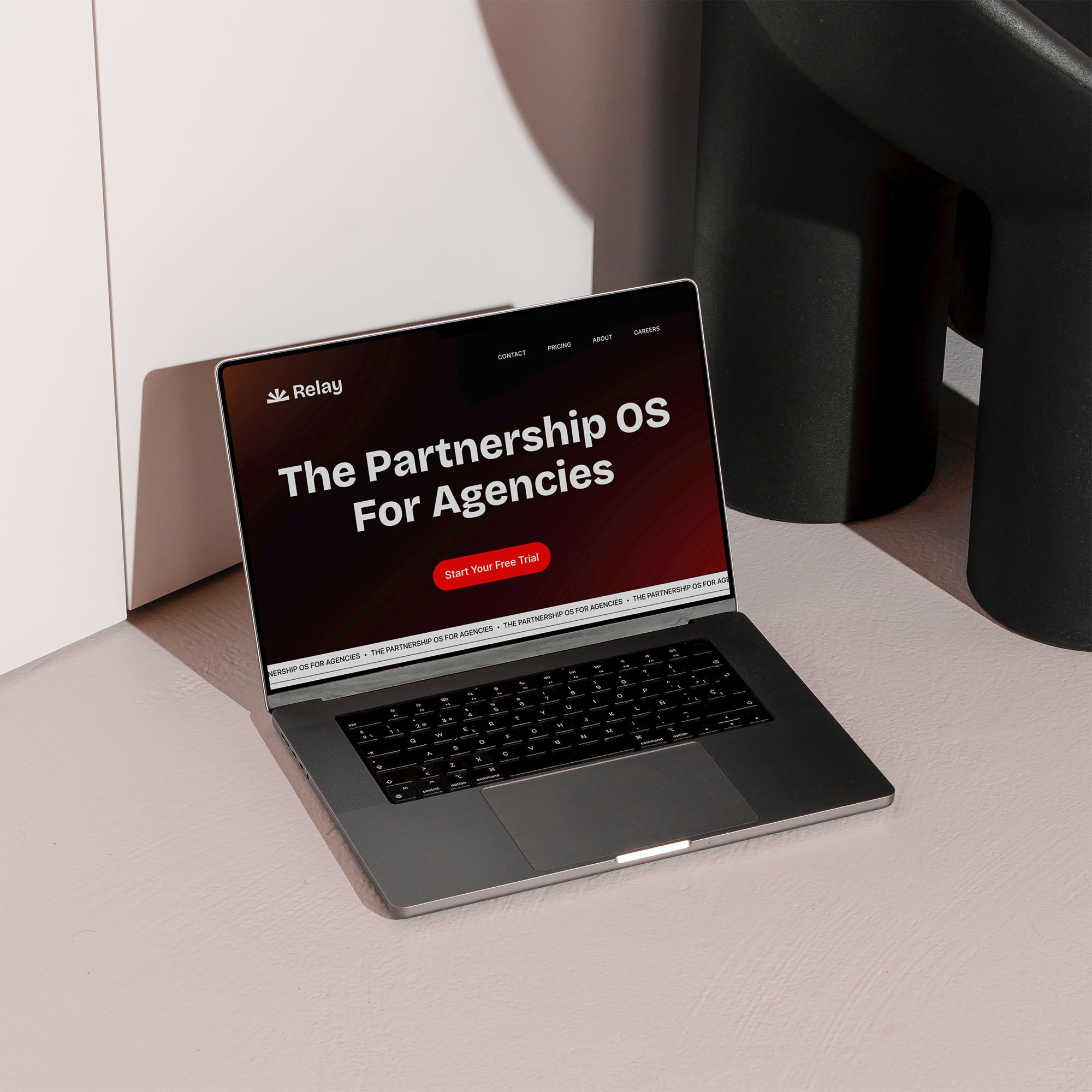
Positioning Relay meant answering one question: what does trust look like for agencies choosing between platforms? I researched competing partnership tools, then built a visual language that reads structured and credible over flashy. That system carried across guidelines, email, slide templates, and one-pagers, and set the foundation for product too. I built the mobile app's icon, color, type, and graphics ahead of any UI work, giving engineering a system to build on.
THE FULL SYSTEM

BRAND FOUNDATIONS
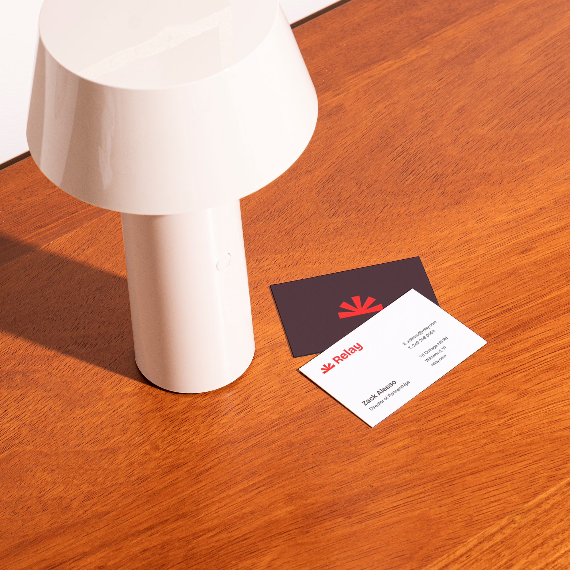
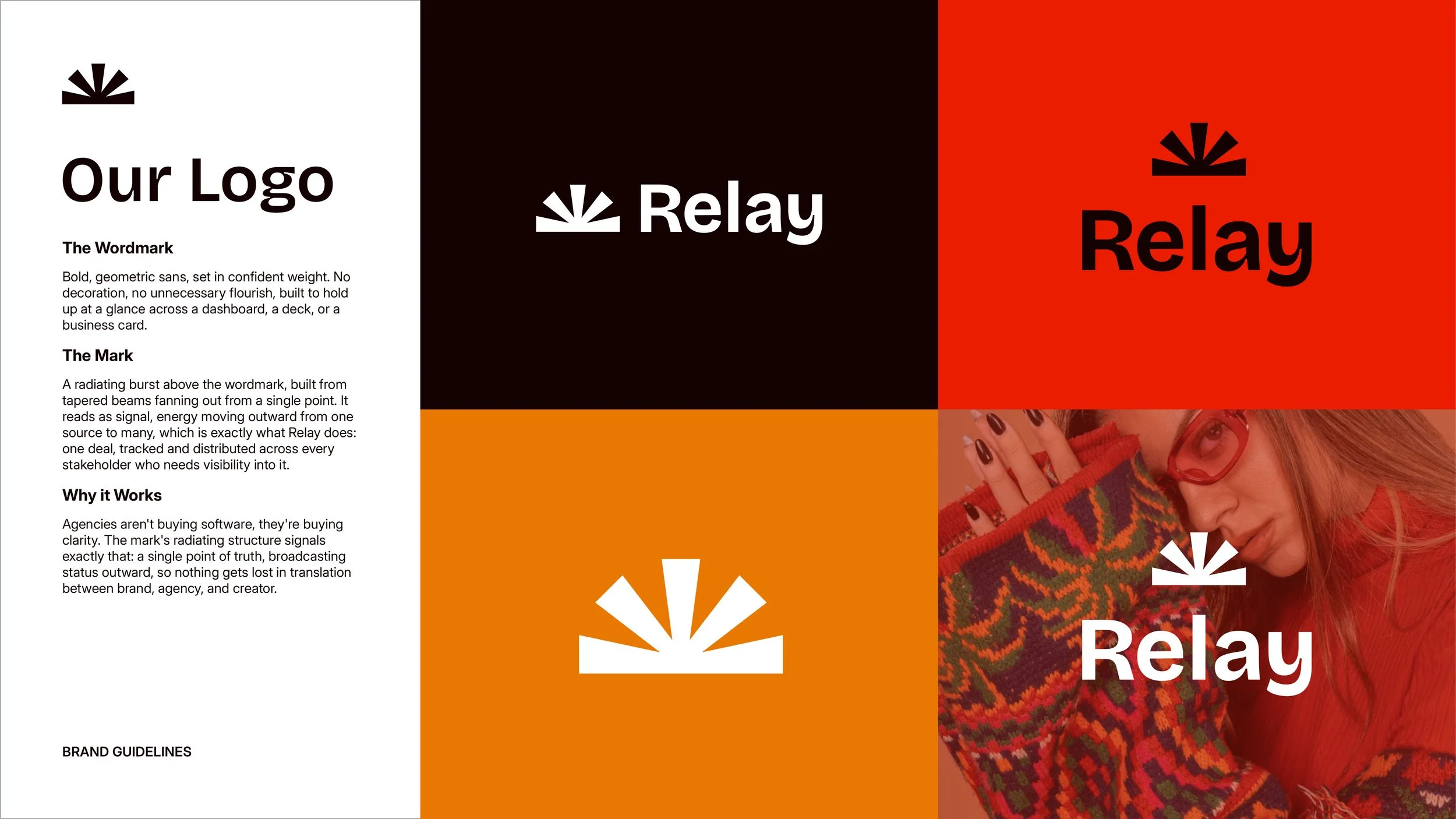
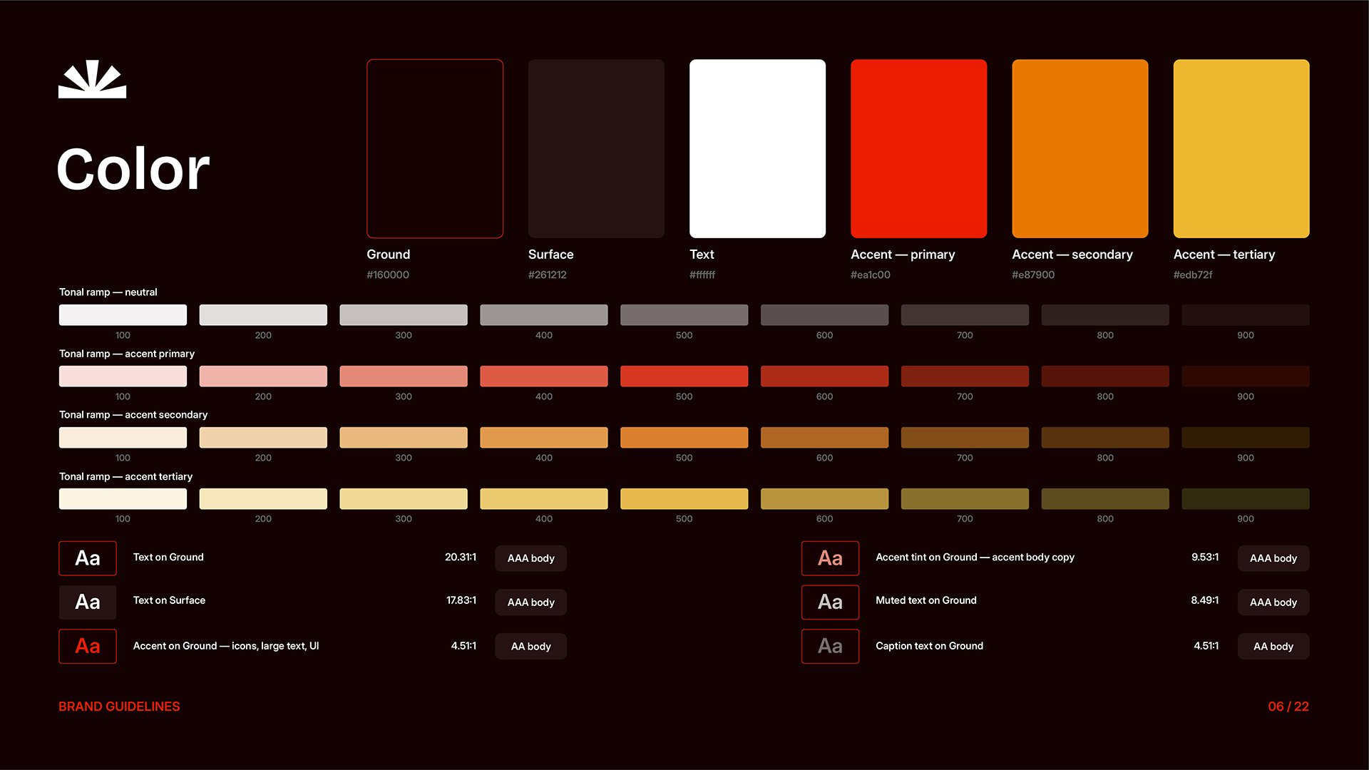
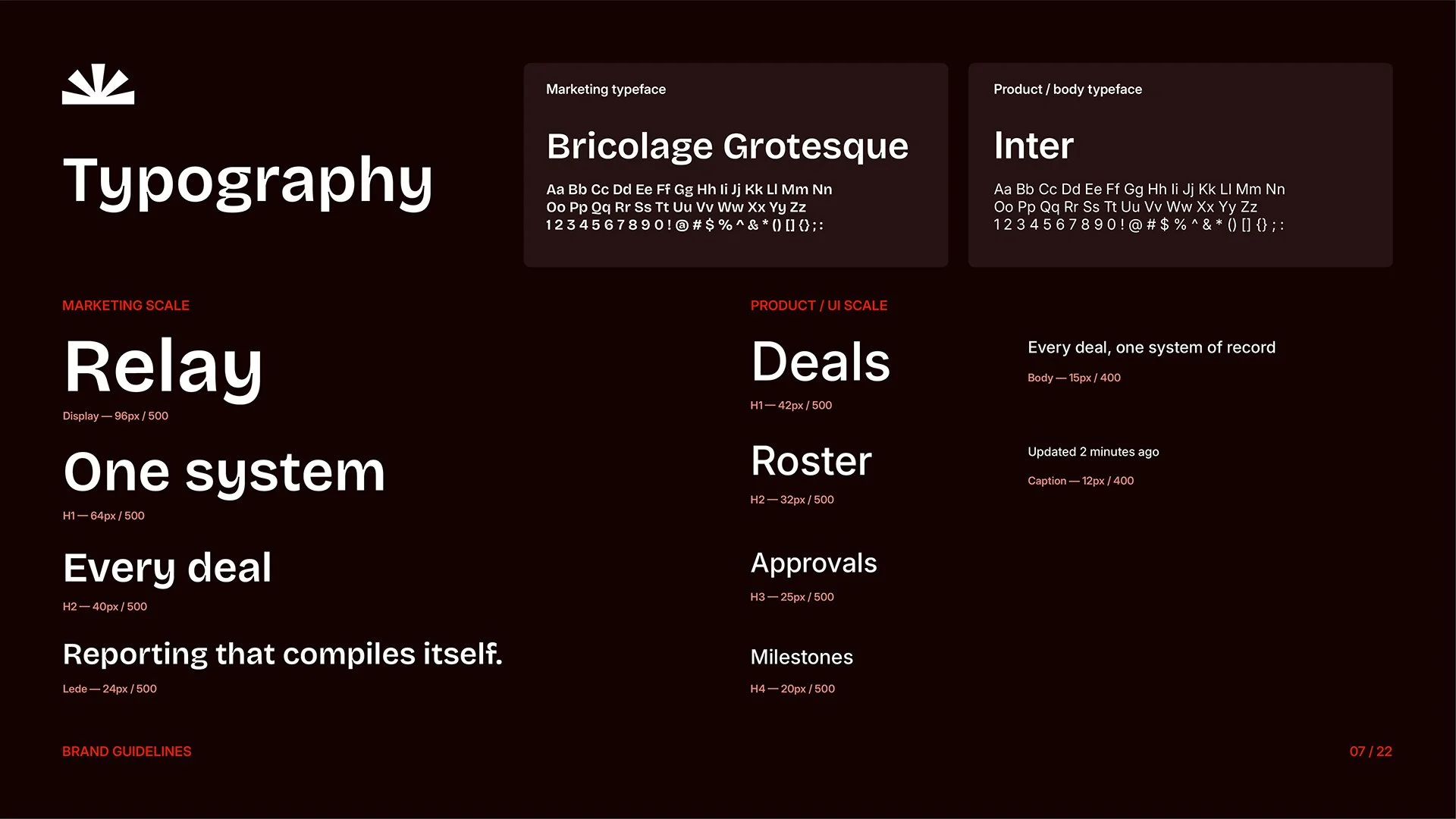
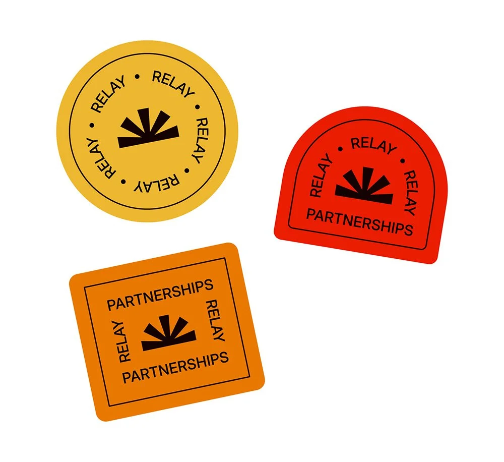
Relay needed to read as serious infrastructure, not another creator-economy app with pastel gradients. The logo scales from sales deck to favicon without breaking. Color carries both brand and data states. Type stays legible in dense UI and holds weight on a title slide.
THE STRATEGY
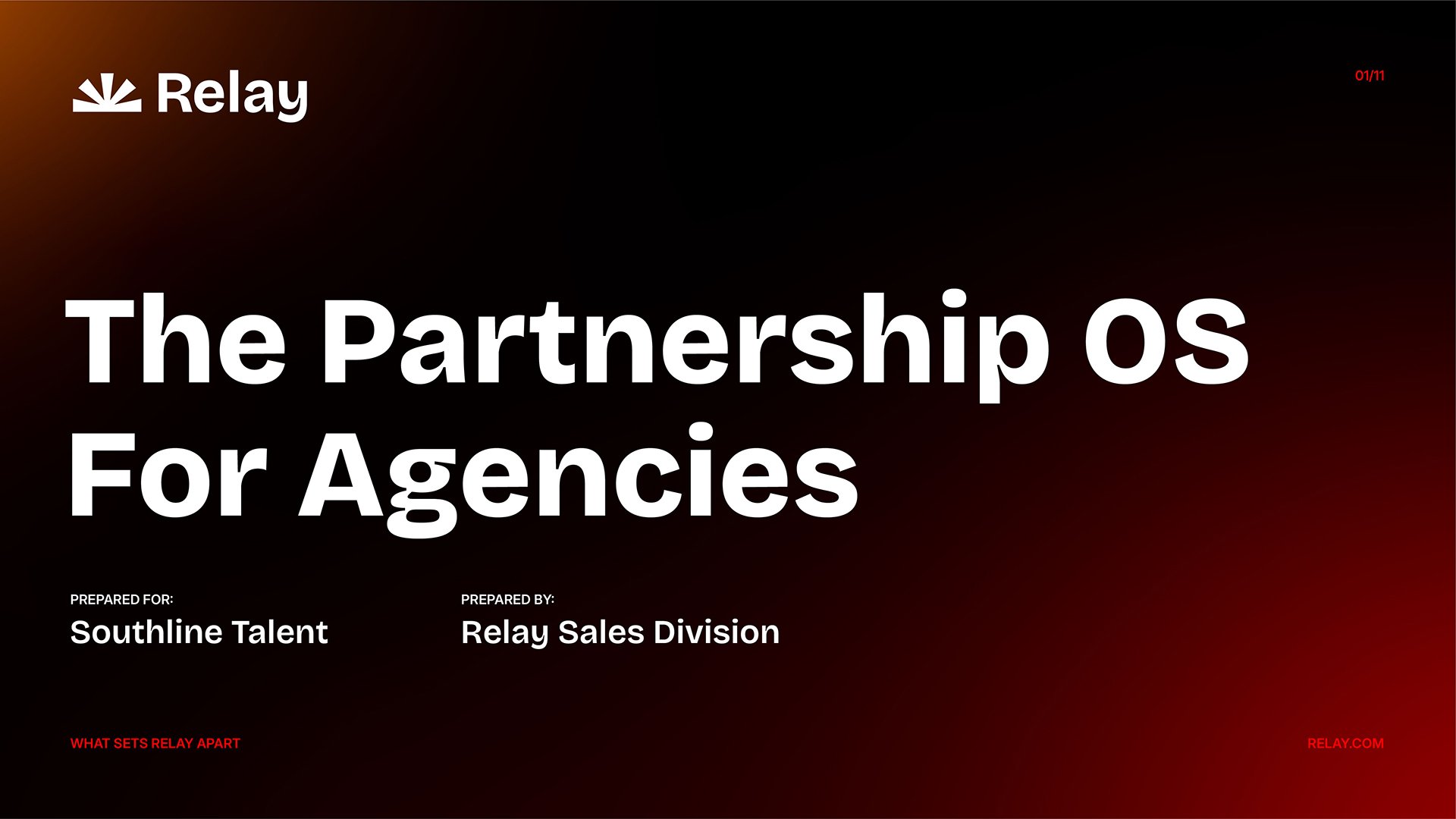
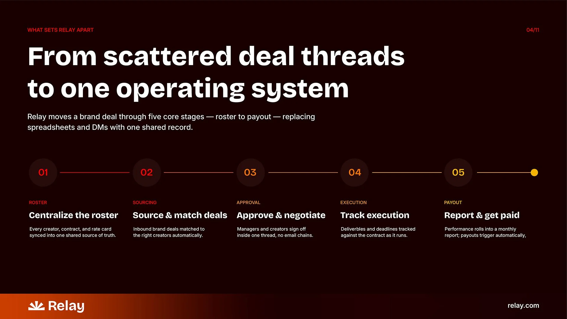
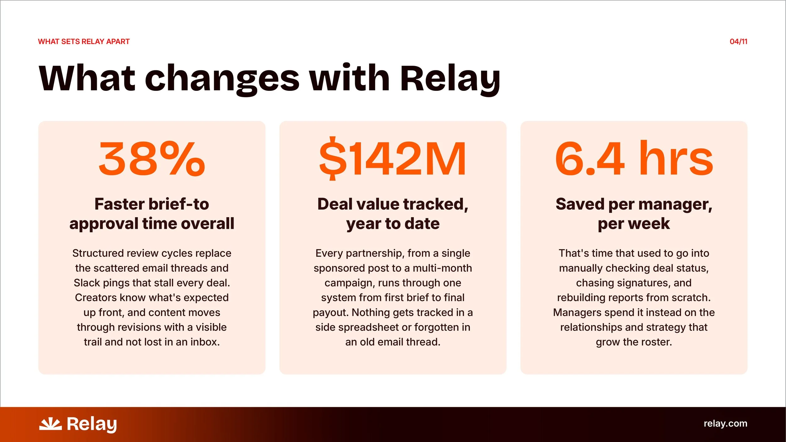
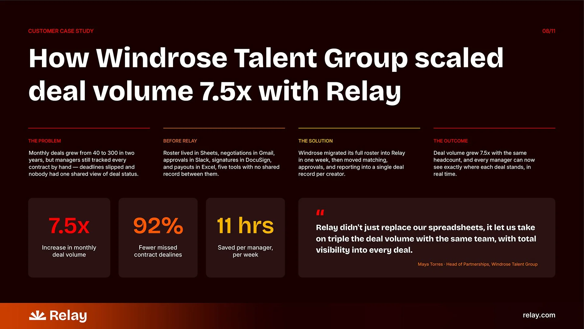
Relay’s pitch decks tackled the challenge of making a full trust argument land without reading like a pamphlet.
The layout and order of the deck content is designed to strategically to kill the "generic CRM" assumption. Stats earn trust before the story does. Process proves it's not vaporware. The case studies land it all on one page.
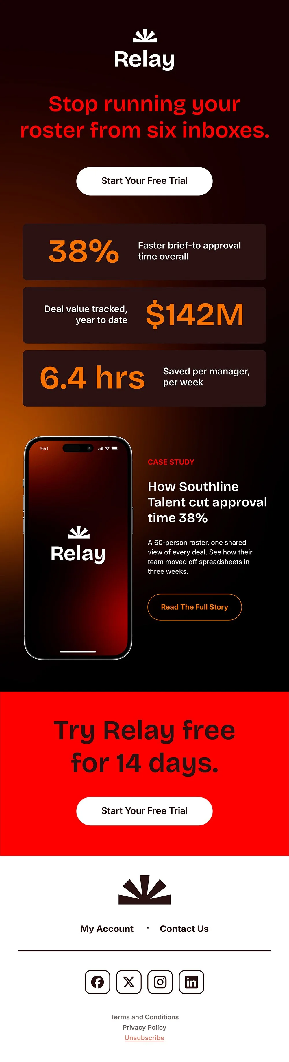
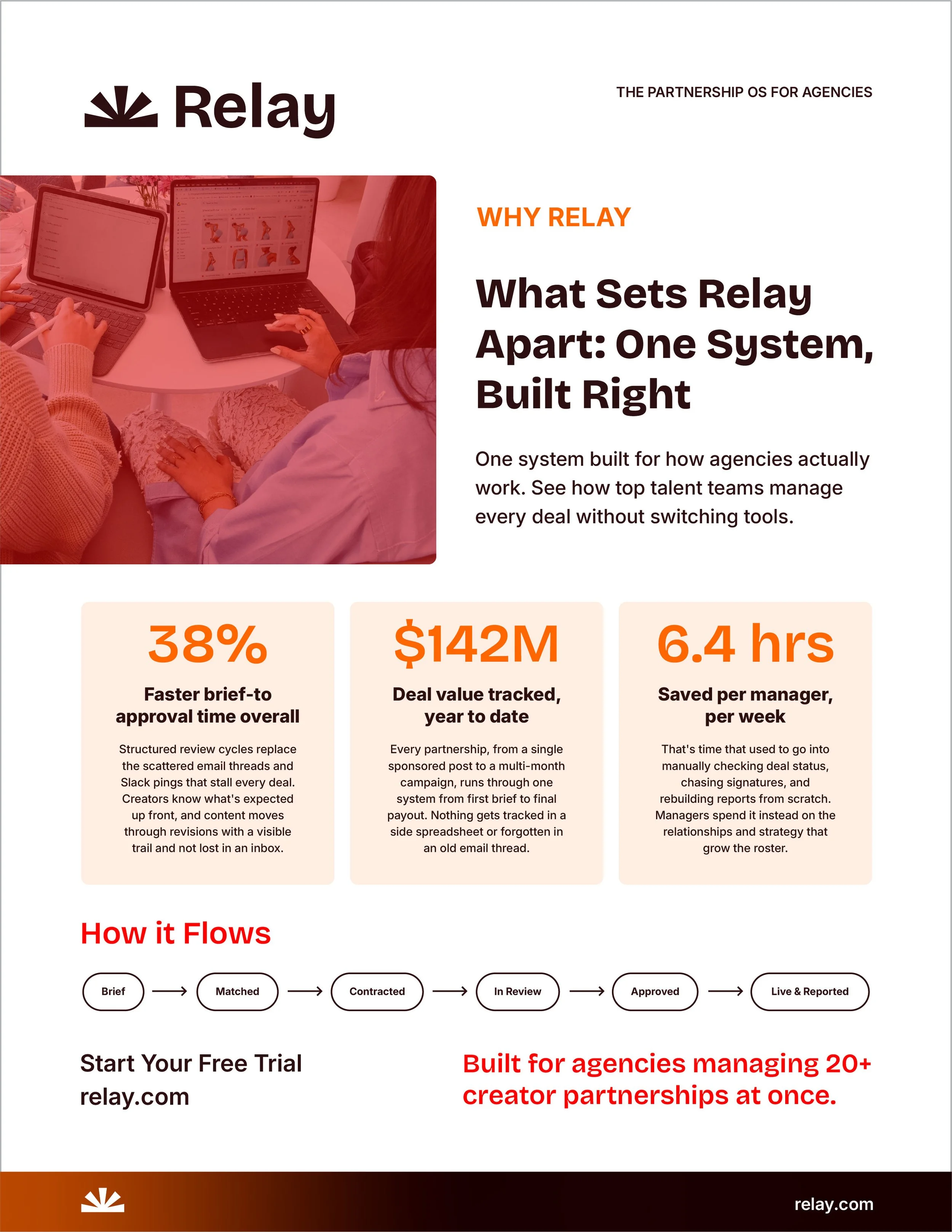
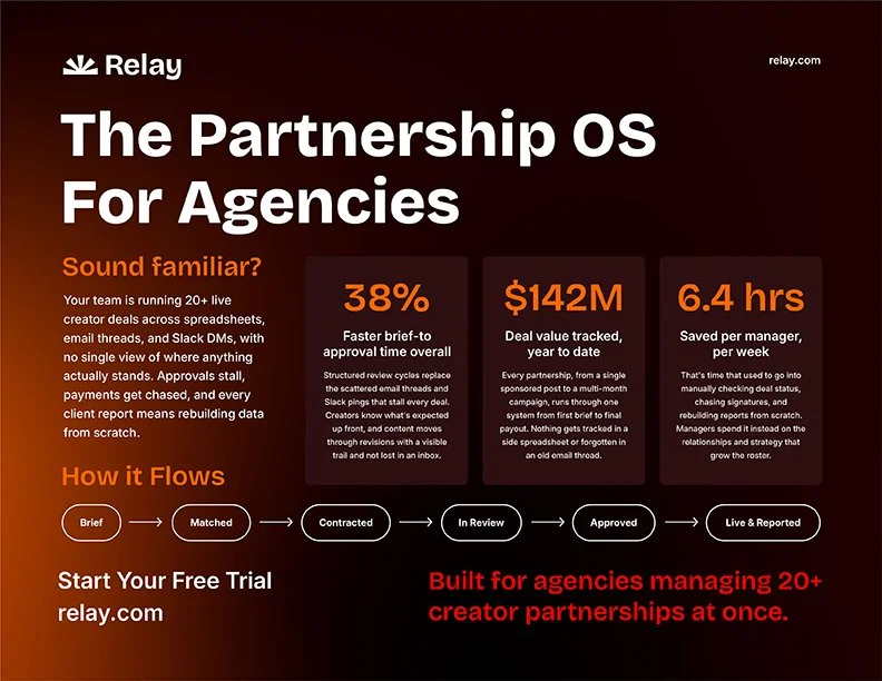
One message had to work across three formats: a scroll-length email, a horizontal one-pager for live pitches, a portrait one-pager as a leave-behind. The challenge wasn't writing three pitches, it was building one hierarchy (problem, fix, proof, CTA) disciplined enough to survive three reading contexts without feeling copy-pasted. I locked the hierarchy first and let layout adapt: vertical pacing for the email, a single eye-sweep for the horizontal piece, top-to-bottom rework for the portrait leave-behind.
THE TRIAL CAMPAIGN